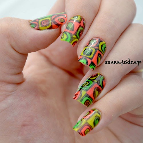
Nail Art & Stamping

Makeuptalk.com forums

Help Support Makeuptalk.com forums:

This site may earn a commission from merchant affiliate links, including eBay, Amazon, and others.
Here's some recent stamping. Here, I appreciate the effect that the colours have on my base - the yellow stamping makes those nails appear more 'turquoise' than 'blue' when you view them at a distance. It's a neat visual trick. Similarly, each nail with concentric rings looks lighter than the plain ones.
Rabbit Hole Ripples rt.jpgRabbit Hole Ripples lt.jpg

 
Glad to share! I look forward to seeing yours. :) /emoticons/[email protected] 2x" width="20" height="20" />  If I do them again, I'll likely use Zoya basecoat again, as it worked well to keep the caviar in place; but I'll also consider using a top coat that can be gently applied with a fully loaded brush to keep the colour on them from wearing off.
Great tips I will keep that in mind when I try it.

 
Here's some recent stamping. Here, I appreciate the effect that the colours have on my base - the yellow stamping makes those nails appear more 'turquoise' than 'blue' when you view them at a distance. It's a neat visual trick. Similarly, each nail with concentric rings looks lighter than the plain ones.

Rabbit Hole Ripples rt.jpg
Rabbit Hole Ripples lt.jpg
Love it! specially the patter with the yellow dots.

 
Here's some recent stamping. I'm commenting here that the Le Chat Black Velvet regular polish (Dare to Wear collection) is super for getting crisp lines AND it doesn't stain the cuticles, which is fantastic. Clean-up was easy. I got it as a duo with the Black Velvet gel polish - also reputed to be fantastic though I have yet to try.

View attachment 7060
 
Here's some recent stamping. I'm commenting here that the Le Chat Black Velvet regular polish (Dare to Wear collection) is super for getting crisp lines AND it doesn't stain the cuticles, which is fantastic. Clean-up was easy. I got it as a duo with the Black Velvet gel polish - also reputed to be fantastic though I have yet to try.
Beautiful!

 
There are many places to post nail art pics on the forum, and here is another. This is my latest with three layers of stamping.
Amazing! I always love how you choose colors that go so well with each other.

 
Amazing! I always love how you choose colors that go so well with each other.
Thank-you! In this one the most interesting combination for me was on the accent nail. I was worried about how the base colour (LynBDesigns Don't Torture Me - a paler periwinkle/purple blue with white flakies that don't show here; you can see the stripes of the periwinkle on the index fingernails that are different from the stripes of mauve Zoya Hudson that are on the other fingers) would work with the blue stamping colour (Konad Pastel Blue - a bit stronger blue with a turquoise leaning when compared to that base) but in the combination, it works! Obviously, because of all that's going on, the difference on the index finger is barely noticeable, but it was when I wore only the base colours. My plan for this mani also included yellow, but I think it worked out better without it (and only because the yellow stamping wasn't sufficiently opaque).

 
Thank-you! In this one the most interesting combination for me was on the accent nail. I was worried about how the base colour (LynBDesigns Don't Torture Me - a paler periwinkle/purple blue with white flakies that don't show here; you can see the stripes of the periwinkle on the index fingernails that are different from the stripes of mauve Zoya Hudson that are on the other fingers) would work with the blue stamping colour (Konad Pastel Blue - a bit stronger blue with a turquoise leaning when compared to that base) but in the combination, it works! Obviously, because of all that's going on, the difference on the index finger is barely noticeable, but it was when I wore only the base colours. My plan for this mani also included yellow, but I think it worked out better without it (and only because the yellow stamping wasn't sufficiently opaque).
I would have never noticed the difference if you didnt point it out. I think it looks great with the colors you chosed the yellow might have been too distracting.

 
Thought I'd pop these photos in here as an example of the sort of thing it's fun to do with layering of stamping images with different colours. This is a good trick when the first layer of stamping doesn't go all that well too. :) This is three layers of stamping.

View attachment 9536View attachment 9537
 
Thought I'd pop these photos in here as an example of the sort of thing it's fun to do with layering of stamping images with different colours. This is a good trick when the first layer of stamping doesn't go all that well too. :) /emoticons/[email protected] 2x" width="20" height="20" /> This is three layers of stamping.
That is some awesome nail art!

 
Back
Top